Augmented reality app for gardening
AR Smart Garden – making gardening accessible to everyone through augmented reality.

AR Smart Garden – making gardening accessible to everyone through augmented reality.

Market research, User research and competitors, Architecture, Wireframe, UI
UX/UI designer
To gain insights into our target users, I conducted interviews with individuals aged 22 to 47 who have a home garden.
When users plan a garden, they want to make it beautiful, divide it into separate sections and lay paths, but they fail to do it the first time and have to redo it, spending extra time and money.
Users do not know how to choose the right plants for their garden, which one is suitable for open sun or shade. Despite the advice they get from the nursery, most of the plants still die.
Often, users do not water the plant correctly because they do not know how much water is needed for a particular plant. As a result, it dies.
I researched the applications of the leading players in the plant care market and studied user reviews to understand their difficulties when using the application.

iScape

Planter

Plantix

PlantNet

Planta

Plant Identifier
I also researched popular AR apps, smart home remote control and camera image recognition.

Smart life

AR measure

Pokeman GO

Draw

Lens

Magicplan

Inkhunter
It is necessary to provide the user with the ability to scan the garden using a camera or upload a photo of it, divide the garden into separate sections, add ground cover (tiles, grass) and plants. The user will be able to create several garden plans and choose the best option.
I propose using the user's geolocation to generate a list of plants suitable for their place of residence. The list of plants will be displayed as cards with images and brief information about the plant and its care. Additionally, the locations of the nearest nurseries will be shown, allowing the user to quickly obtain the necessary information about purchasing the plants.
It is necessary to create a plant watering schedule based on the user's geolocation and weather conditions. Users should be able to edit the date and time of watering. I also suggest sending reminders so that the user does not forget to water the plants.
After carefully considering the problem and analyzing user interviews, I created the app architecture, which allowed me to visualize the user flow. This helped me able to identify critical touchpoints for users and design a more intuitive experience.

After completing the initial architecture phase, I started to visualize my ideas by creating sketches. This allowed me to explore various design options and refine the structure of the application early on in the design process. By creating sketches, I was able to quickly make changes without committing to a specific design direction.

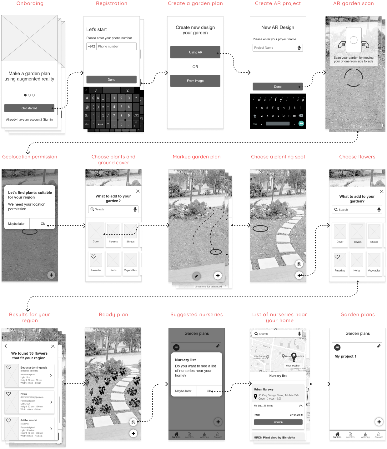
By creating low-fidelity wireframes, I was able to gain a deeper understanding of the process for adding plants to a garden plan. This allowed me to make necessary adjustments and improvements, such as editing the TabBar and adding missing elements
%201.png)
Taking into account the missing details identified during the process of adding plants to the garden plan, I created low-fidelity wireframes using Axure.

In conclusion, I aimed to create a modern and clean design that utilizes a minimal color palette for easy and efficient usage of the application.
Creating a garden plan and plant placement using Augmented Reality

Personalized plant recommendations depending on the geolocation of the user’s garden.

Personalized plant recommendations depending on the geolocation of the user’s garden.

Location nearby nurseries based on user's geolocation for convenient access.

Creating an elderly care circle and assigning tasks to caregivers